I’ve been saying that whatever politicians, media and their zealot followers label or lay claim as “austerity” programs has been a blatant canard.
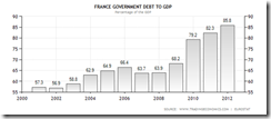
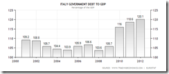
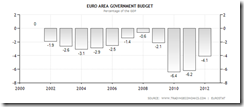
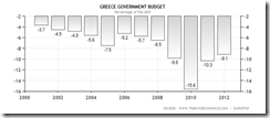
The precious deck of graphs below from tradingEconomics.com give us the perspective
First the Eurozone’s Government Debt to GDP
Ok, one might argue that the steady ascent of government debt relative to GDP has been happening because of recessions or economic growth slowdown.
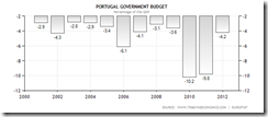
So the second set of graphs which exhibits their respective fiscal conditions is meant to give us a better understanding.
Note, reference points of comparisons are very important and sensitive to making claims.
It is TRUE that government spending in the aforementioned countries above has somewhat been reduced compared to, or when based from 2010.
But except for Portugal, whose authorities have admitted that government spending does NOT work, spending levels have substantially been elevated compared to, or based from 2000-2007 for most of the Eurozone, especially the crisis afflicted nations. Add to this the ballooning balance sheets of the ECB.
From the above, we can see that whatever claims of “austerity” have been representative of half-truths, and which in reality, signifies as terminological prestidigitation.
So the return of pro-welfare governments will only exacerbate their current woes based on unsustainable political economic conditions and amplifies the transmission of the many risks (credit, currency, inflation, interest rate and etc...) to the world.






No comments:
Post a Comment