While March 30th has traditionally been the day where the S&P 500 has been up the least, 9/30 is tied for fifth at 38%. Since 1945, the S&P 500 has declined an average of 0.15% (median: -0.25%) with positive returns just 38% of the time on 9/30. While the long-term performance of the S&P 500 on the last day of September has been poor, in recent years it has been even worse. In the current bull market, if the stock market has been open on 9/30, it has traded down
The art of economics consists in looking not merely at the immediate hut at the longer effects of any act or policy; it consists in tracing the consequences of that policy not merely for one group but for all groups—Henry Hazlitt
Thursday, October 01, 2015
Example of Gambler’s Fallacy: The US Stock Market’s Rip on a Traditionally Down Day of September 30
Sunday, November 04, 2012
The Likely Impact of US Presidential Elections on the Stock Markets
numerical probabilities serve to gratify one’s cognitive biases which in essence is a form of self-entertainment rather than a dependable methodology for risk analysis
When an individual erroneously believes that the onset of a certain random event is less likely to happen following an event or a series of events. This line of thinking is incorrect because past events do not change the probability that certain events will occur in the future.
The Federal Register, a publication with all the country’s (federal, nonclassified) rules is now over 81,000 pages long. President Obama’s Affordable Care Act is 906 pages. The Dodd-Frank Act totals 849 pages. Once upon a time, in 1913, the Federal Reserve was created with only 31 pages. The U.S. Constitution required only six pages.
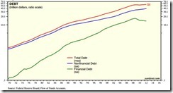
After beginning 1990 at $12.8 TN, Total System Marketable Debt ended June 2012 at $55.0 TN. And Washington politicians and central bankers are now doing everything they can to sustain the Credit boom and avert the downside of an historic Credit cycle. Similar efforts are afoot globally.
The Fed is in effect subsidizing U.S. government spending and borrowing via expansion of its balance sheet and massive purchases of Treasury bonds. This keeps Treasury interest rates abnormally low, camouflaging the true size of the budget deficit. Similarly, the Fed is providing preferential credit to the U.S. government and covering a rapidly widening gap between Treasury's need to borrow and a more limited willingness among market participants to supply Treasury with credit.The failure by officials to normalize conditions in the U.S. Treasury market and curtail ballooning deficits puts the U.S. economy and markets at risk for a sharp correction.
Finance is a black box covered by a veil. Not only are the inner workings hidden, but the inputs are also obscured, by bad economic data, conflicting news report or outright deception…And then there is the most confounding factor of all, anticipation. A stock price rises not because of good news from the company, but because the brightening outlook for the stock means investors anticipate it will rise further, and so they buy. Anticipation is a feature unique to economics. It is psychology individual and the mass—even harder to fathom than the paradoxes of quantum mechanics. Anticipation is the stuff of dreams and vapors.
Sunday, August 14, 2011
How Reliable is the S&P’s ‘Death Cross’ Pattern?
Mechanical chartists say that with the recent stock market collapse, the technical picture of the US S&P 500 have been irreparably deteriorated such that prospects of a decline is vastly greater (which has been rationalized on a forthcoming recession) than from a recovery. The basis of the forecast: the Death Cross or ‘A crossover resulting from a security's long-term moving average breaking above its short-term moving average or support level[1]’.
First of all, I’ve seen this picture and the same call before.
In July of last year, the S&P also experienced a similar death cross. Many articles emphasized on the imminence of a crash[2] that never materialized.
Secondly, I think applying statistics to past performances to generate “feasible” odds on a bet based on the ‘death cross’ represents as sloppy thinking
To wit, betting based on a ‘death cross’ signifies a gambler’s fallacy or fallacy committed when a person assumes that a departure from what occurs on average or in the long term will be corrected in the short term[3].
A coin toss will always have a 50-50 head-tail probability distribution. If the random coin toss exercise would initially result to string of ‘heads’ outcome, the eventual result of this repeated exercise would still result to a 50-50 outcome or a zero average, as shown by the chart below.
As the illustrious mathematician Benoit Mandelbroit wrote[4],
If you repeat a random experiment often enough, the average of the outcomes will converge towards an expected value. With a coin, heads and tails have equal odds. With a die, the side with one spot will come up about a sixth of the time
Applied to the death cross, we see the same probability 50-50, because each event from where the ‘death cross’ appears entails different conditions (finance, market, politics, social, cultural, even time and spatial differences and etc), as earlier argued[5]. It would signify a sheer folly to oversimplify the cause and effect order and speciously apply odds to it.
Proof?
One would hear proponents bluster over the success of the death cross in 2000 and 2007. Obviously the hindsight bias can be very alluring but deceptive. The causal relationship which made the ‘death cross’ seemingly effective in 2000 and 2007 for the US S&P 500 had been mostly due to the boom bust cycles which culminated to a full blown recession or a crisis during the stated periods.
The death cross was last seen in July of last year (green circle above window), but why didn’t it work? The answer, because the death cross had been pulverized by Bernanke’s QE 2.0 (see green circle chart below). When Mr. Bernanke announced QE 2.0, the ‘death cross’ transmogrified into a ‘golden’ cross!!! This shows how human action is greater than historical determinism or chart patterns.
Many mistakenly think that chart patterns has an inherently built in success formula which is magically infallible, as said above, they are not.
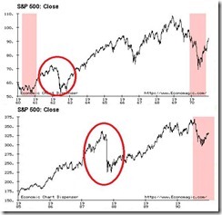
Third, not all market crashes has been due to recessions.
The above illustrates the crash of 1962 (upper window) and 1987 (lower window)[6]. This is obviously unrelated to the death cross, however the point is to illustrate that not every stock crash is related to economic activities. The recent crash may or may not overture a recession.
Bottom line: The prospective actions of US Federal Reserve’s Ben Bernanke and European Central Bank’s Jean-Claude Trichet represents as the major forces that determines the success or failure of the death cross (and not statistics nor the pattern in itself). If they force enough inflation, then markets will reverse regardless of what today’s chart patterns indicate. Otherwise, the death cross could confirm the pattern. Yet given the ideological leanings and path dependency of regulators or policymakers, the desire to seek the preservation of the status quo and the protection of the banking class, I think the former is likely the outcome than the latter.
And another thing, we humans are predisposed to look for patterns even when non-exist, that’s a result of our legacy or inheritance from hunter gatherer ancestors’ genes whom looked for patterns in the environment for survival or risked being eaten alive by predators. This behavioural tendency is called clustering illusion[7]. A cognitive bias which we should keep in mind and avoid in this modern world.
[1] Investopedia.com Death Cross
[2] The Economic Collapse Blog, The Death Cross: Another Sign That We Are On The Verge Of A Recession?, July 5, 2010
[3] Nizkor.org Fallacy: Gambler's Fallacy
[4] Mandelbrot, Benoit B The (mis) Behaviour of Markets, Profile Books p.32
[5] See The Causal Realist Perspective to the Phsix-Peso Bullish Momentum, July 10, 2011
[6] About.com Stock Market History
[7] Wikipedia.org Clustering illusion


