Showing posts with label CPI inflation. Show all posts

Sunday, July 10, 2016

Even at Only 7,800: PSEi Hits Historic Proportions in Terms of Valuations Excesses!

This week’s outline

Even at Only 7,800: PSEi Hits Historic Proportions in Terms of Valuations Excesses!
-Déjà vu 1996? Furious Pumping Sends PSEi Valuation Excesses to 1996 Levels!
-Broadening Misperception: Historic PERs Not Just About Price Pumping, But Lethargic Earnings Growth!
-BSP’s Silent Stimulus Will Aggravate the Malinvestments and the Coming Violent Market Clearing Process!


Even at Only 7,800: PSEi Hits Historic Proportions in Terms of Valuations Excesses!

Activities at the Philippine Stock Exchange have reached historic proportions.

The headline index has yet to match the April 2015 milestone threshold of 8,127.48 but current developments have already signified epochal scales in the context violent price pumping.

And since actions have consequences, the ramifications of such frenetic or manic episodes of price pumping (combined with rampant manipulations) have led to the panoply of momentous vertical price charts for the PSEi majors.

And since price pumping equates to the disproportionate increase in prices relative to fundamentals, or price multiple expansions, or seen in economics as mounting imbalances between prices and fundamentals, thus another consequence has now been manifested through the acceleration of climatic valuations!

Déjà vu 1996? Furious Pumping Sends PSEi Valuation Excesses to 1996 Levels!

Early last week, the Philippine Stock Exchange updated their PER data to incorporate the overall performance of listed companies for the year 2015.

As a side note, I validated this by looking at the SMPH’s 2015 annual report where the firm’s earnings for the year 2015 was at Php .982 per share. At Friday’s closing price of Php 27.5 per share, PER was at 28.004. This number matched the PSE’s data. In 2015, SMPH had a huge jump in earnings due to one off extraordinary gains (Php 7.4 billion) from sale of marketable securities. The 2015 data bloated the eps and artificially reduced the lather from the previous high PER. But being an extraordinary item, in the 1Q 2016, the firm’s earnings at .202 represented a 54% drop. So SMPH 1Q annualized (1Q eps x4) would still entail a fantastic 34 PER!

Based on the PSE’s PER* as of Friday’s close, the average PER catapulted to an earth-shattering 1996 level of 25.7!!! It was even at 26.06 last Monday, the Fourth of July!

Meanwhile, the market cap weighted PER now stands at a staggering 26.65!!!

The PSEi was down by .75% this week but the average PER rocketed by 30.8% to 25.7 from 19.65! This means that the average PER have now caught up, or closed the gap with the market cap weighted PER!

Nota Bene: The PSE includes the PER on their quote page which is updated real time. The PSEi’s average PER represents the summation of indicated PER of the headline 30 composite members divided by 30. PSEi PER= Σ PER (of 30 issues)/30. The market cap weighted PER is the summation of PERs of the headline composite members multiplied by their respective % share in terms of market cap weight during the period of reckoning. Market cap PSEi PER= Σ PER x market weight (of 30 PSEi issues). Market cap weights are also reflected real time on the PSE’s index composition page. I routinely tabulate and input the closing figures at the trading week’s end. Anyone can go to the PSE website to generate their data.

Aside from their reckless and disingenuous cheerleading, the PSE’s apparent taciturn on the performance of listed firms has prompted me to write disparagingly on them. It appears that the annual report card for the PSE universe will be published in their coming monthly report for May. But like the 2Q and 3Q reports, I suspect or doubt that they will broadcast a summary as part of their “press room” disclosure, if the results have been dismal.

The PSE only brandishes their data only when the numbers fit on their preferences. Or the PSE highlights the numbers only if they resonate on G-R-O-W-T-H theme which palpably has metastasized into a political slogan! That’s the stylized du jour version of financial professionalism. That was the case for the last two quarters where the PSE universe underperformed. Total silence.


Yet what the PSE reckons as the PER for a specified period is the PER of the last trading day of the said timeframe. This applies to the monthly or annual data.

This means that in 1996, the PER of the last trading day of December 1996 reflected on the 1996 data, the PER of which was at 26.14 (left window).

What this illustrates has been that the contemporary PERs have already matched the 1996-1997 levels!

Yet the end December 1996 PER level had been extended further for the next three months, in particular 28.21 in January 1997, 27.35 February and 27.57 in March (right window)! This happened even when the PSEi grew by only 1.65% over the three month period.

(Just a side note, the PSEi composition and methodology have been different then and today. So it is unclear how accurate the headline numbers are)

Nevertheless, the 1996-1997 episode only demonstrated that ultra-high valuations only means negative returns.

Said differently, prices and returns have an INVERSE relationship, ceteris paribus (given all things constant). The higher the price paid for an expected stream of future cash flows would only translate to lower returns for a perceived investment over time.

Just take a listed firm, ABC with say a fair value of Php 10. If the ABC’s share price is at Php 8 then expected return should be 25%. At Php 9, this would be 11%. At Php 10, returns should be ZERO. Anything in excess of Php 10, or its fair value, would mean NEGATIVE returns.

So prices can only go permanently higher only if the laws of economics and finance (via valuations) have been rendered obsolete or broken. Though the same price-return valuation relationship do not discount that prices can go up momentarily.

The 1996-1997 aeon have only demonstrated that such fundamental laws existed. It delivered a fatal blow to popular expectations—through a 68% market crash. Though of course, price-valuation imbalances remained elevated for a certain period of time before the day of reckoning.

Such market crash, thus, put into spotlight the statistical law called the reversion/regression to the mean. The market cleared valuation excesses via the reversion or regression to the mean. The Asian crisis, which belatedly appeared in July of 1997, only served as trigger to such mean reverting process.

The 1996-97 lesson applied today.

Should the 1996-1997 milepost rhyme, then this means that while the current episode could further extrapolate to even higher prices, that should magnify valuation dislocations, any further upside run will likely be limited.

Moreover any further runup will extrapolate to intensifying market risks in the face of enhanced buildup of price-fundamental discrepancies.

And should history serve as blueprint of the present, then current developments indicate that present price levels would represent a crucial turning or inflection point!

Broadening Misperception: Historic PERs Not Just About Price Pumping, But Lethargic Earnings Growth!

Since PER represents a ratio between prices and reported earnings, it looks most likely that not only has the spike in the headline index PER been about rabid price inflation, but also about the denominator, or an earnings growth issue.

For a specific time period, the PSEi price index level can be divided by the estimated PER to generate an estimated nominal based earnings to represent the index.


Nevertheless I’d rather wait for the official PSE disclosure to see the outcome.

The past provides a clue. Through the 3Q of 2015, whether income or revenues, the official numbers had only evinced inertia. Revenues and income for listed companies, including PSEi composite members, were mostly drifting in the negative.

And this has been why these numbers have not made it through the PSE’s “press room”. Any facts outside the G-R-O-W-T-H theme must be considered as an anomaly thus excluded from official announcements or censored!

And I surmise that the based on a back of envelop calculations, fourth quarter numbers could even be WORST!

Hence, the current ferocious price pumping in the face of growing divergence with real developments represents the worst dynamic in motion—concrete signs of widening misperception!

And current unfolding conditions have only reinforced my suspicions of why the BSP launched a silent stimulus in 4Q 2015-1Q 2016!


The chart above represents the distribution of PERs according to the quintile market cap ranking based on Friday’s data.

Again it shows of the concentration of the HIGHEST PERs towards the top 15 or specifically, the top 5.

However, the huge leap in the 16-20 quintile has been mainly due to the surge in ICT’s PER to 124!

Yet the end of the year for 2015 numbers could only likely mean an extension of the stagnant 9 month performance.

Moreover, to fill in the blanks, the 1Q 2016 30 PSEi eps numbers gives us clues to the 2015 report.

The present savagery in price pumping has come even as eps continues to falter! Not just in 2015.

For the PSEi, 1Q 2016 eps growth slipped by 2.25% over the comparable period!

It’s not just the headline numbers that has been bad. The breadth and quality of earnings appear to be in decay.

Firms with at least 10% in eps growth or the outperformers accounted for only 16 or 53% of the PSEi universe.

Firms with less than 5% growth (2015 NGDP was 5.2%) totaled 8 or 26.67% of the Phisix.

5 firms or 16.67% of PSEi issues posted growth rates that were down (negative) from last year. One posted negative or loss.

Overall, 14 or 47% of the Phisix had underperformed. And most of the underpeformance comes exactly were the furious vertical pumping had occurred—the top 15! 9 out of the top 15 or 60% had performed below par in 1Q 2016 relative to last year!

1Q 2016’s underpeformance numbers have now been far greater than the 2Q 2015 numbers where only less than a third had lethargic eps growth.

Moreover, a vast majority of listed firms has shown of declining top line numbers or revenues. This means that most of the growth in eps had emerged from cost side reductions. This only reveals that the 6.9% 1Q GDP was a puffery!

Again this goes to show why the BSP had taken action in 4Q 2015-1Q 2016.

Also this exhibits why the mainstream has been inundated by misinformation, balderdashes or drivels, like the 4G telecom monopoly that has served as fuel to a frenzied 5 month + pump!

That’s because industry and economy wide eps has been hurtling downward!

BSP’s Silent Stimulus Will Aggravate the Malinvestments and the Coming Violent Market Clearing Process!

Of course, I do not discount that the sudden spike in bank credit growth from 4Q to the present could provide a TEMPORARY boost to NGDP and eps.

Nonetheless, the bank credit response to the BSP’s silent stimulus would postulate to an enlargement or the amplification of an already existing excess capacity in bubble sectors, the accretion of deeper mispricing (as seen in the vertical pumping of stocks, but has yet to be seen in property), significant degeneration of balance sheets of credit recipients and credit providers, and most importantly, the loss of purchasing power by Philippine resident consumers.

Proof?


June CPI spiked by a stunning 18% to 1.9% from May’s 1.6%!

The BSP explained (bold mine): The higher June headline inflation was driven mainly by higher prices of most food commodities, particularly meat, fish, fruits, milk, cheese, and eggs, as well as vegetables. At the same time, non-food inflation went up as price increases of clothing, furnishings, and household equipment as well as service-related CPI components such as education, health, and catering services more than offset the decline in electricity rates and in the prices of domestic petroleum products.

Food accounted for 36.29% in BSP’s CPI basket. Food related restaurant CPI which represented the second largest non-food category has a 12.03% share. Education and health which ranked fourth and sixth has 3.36% and 2.99% share. To wit, food, food related services and basic spending on health and education has accounted for 54.67% of the consumer’s income.

It’s not just the CPI, there has similarly been a fantastic surge in prices at the retail levels (+37.5% in May to 2.2% from April’s 1.6%).

From the Philippine Statistics Authority (bold mine):  The annual growth of the General Retail Price Index (GRPI) in the National Capital Region (NCR) moved up by 2.2 percent in May 2016. It was registered at 1.6 percent in April 2016 and 1.5 percent during the same month in 2015. Higher annual increases were recorded in the indices of food at 5.7 percent; beverages and tobacco, 1.9 percent; crude materials, inedible except fuels, 1.4 percent; and manufactured goods classified chiefly by materials, 0.7 percent.

Let us assume that these statistics have not been understated. Or let us give the benefit of doubt that these figures somewhat reflects on actual developments. This tells us that overall, the abrupt swelling of prices in basic items means LESSER disposable spending power for consumers. That’s if the erosion of consumer spending power through price level inflation have not been offset by income growth.

Yet with the PSE’s performance as a guidepost, then the 1Q 2016 data hardly provides evidence that income has grown enough to offset the ongoing corrosion of the consumer’s purchasing power.

And more signs that whatever stimulus implemented has hardly been felt in the job markets.


Major online job advertisers as Monster.com and the largest online job website, Jobstreet.com, have shown bounces off the recent lows. But such bounces may reflect on cyclical responses rather than a structural recovery.

Not even the BSP silent stimulus appears to have filtered into Jobstreet’s nominal based job openings which appears to be turning lower again [see lower window] (I tabulate this every Thursday).

So just where are the jobs to provide spending power for consumers?


OFW remittances? The BSP fidgeted with the April remittance data perhaps to hide another negative remittance growth rates last March.

Yet OFWs growth rates are clearly headed downhill. OFW remittances are unlikely sources of marginal demand and income growth.

And here is a curiosity. The government says that since the Philippine NGDP grew by 5.2% in 2015, disposable income grew by ONLY note 6%!

From the Philippine Statistics Authority: “Net National Disposable Income amounted to Php 15.0 trillion in 2015 or 6.0 percent higher as compared to Php 14.1 trillion in 2014. With the HFCE and GFCE amounting to PhP 9.8 trillion and PhP 1.5 trillion, respectively, total Savings in 2015 amounted to PhP 3.7 trillion, up by 1.9 percent from 2014.”

The plunge in CPI (thereby GFCE) most likely helped contribute to the disposable income growth data. Of course, I would suspect that this had been tilted to the higher income levels (or the few beneficiaries of the credit boom) to have lifted the aggregate numbers.

YET go back to the 2015 NGDP figures. In the year 2015, the NGDP performances of the bubble industries: Construction 10.4%, Real Estate 10.3%, Retail 7.5%, Hotel and restaurants 9.7% and financial intermediation 7.6%.

To repeat, from the government’s perspective: Disposable income grew by only 6%. Yet all these industries ballooned by MORE than the growth rates of disposable income. Since every industry competes for the consumer’s peso or disposable income, then just what happens to the variance or the gap in the growth rates between the industry and consumers? Would this not translate to excess capacity??!!!

You see, malinvestments reveal themselves even in government numbers!

And because the numbers cited are from the government, disposable income is likely to be overstated, while based on industry declarations, previous declared expansion numbers suggest that some like real estate and retail could be understated.

All one has to do is to look at bank credit loans to the industry.

Yet with disposable income under pressure from spiraling inflation rates, just who will buy all such massive outgrowth in the supply of shopping malls, office condos, horizontal and vertical housing and hotels and casinos?

The BSP hasn’t learned. They inflated domestic liquidity M3 by 30%+++ for 10 consecutive months in 2H 2013-1H 2014. And these caused massive displacement in the economy from which side effects (as reflected the erosion of eps, jobs and income and etc…) continues to linger.

YET with the silent stimulus, they apply more of the same treatment to the very symptoms that emerged out of their 2009 “trickle down” policies of borrowing growth from the future to pump GDP today.

The BSP can never learn because this represents the prevailing central bank dogma adapted by contemporaneous central bankers everywhere.

The central bank catechism: Spend the economy to prosperity by through credit expansion! Forget the balance sheets!

And because balance sheets are not just imaginary and serve as real function to every entity, the “spend to prosperity via debt” paradigm has only been disintegrating.

So worldwide, we now see central bank actions sending debt levels skyrocketing even as the war on interest rates escalate. The war on interest rates is now being conducted via negative interest rate policies (NIRP) and bans on cash transactions!

And worst, the central banking easy money doctrine transformed into policy applied to the Philippines have only been intensifying price-fundamental misalignment at the Philippine Stock Exchange.

Thus the credit expansion fueled historic price pumping activities have now been manifested through a landmark disparity in terms of price valuations!

The ramifications of which—if history where to rhyme would be an earth-shattering nasty market clearing process via a reversion to the mean!

A historical milestone has been set just last week!

Wednesday, March 18, 2015

Statistical Inflation Diverges from Reality: In UK, e-Cigarettes and Craft Beers have been included

Governments arbitrarily conjure up statistical numbers to show what they want to show…

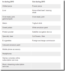
So e-cigarettes, craft beers, streaming music among other items have been included in the UK’s government statistical measure of inflation.

image

From the BBC (bold mine)
E-cigarettes and specialist "craft" beers have been added to the basket of goods used to measure the UK's inflation rate.

The additions are part of the Office for National Statistics' (ONS) annual revision of the basket.

The cost of music streaming services has been added as well, but sat-navs have been dropped.

The basket of goods currently contains 703 items and services, of which 13 are new this year after eight were removed.

The inflation rate currently stands at a record low of 0.3%, as measured by the Consumer Prices Index.

Price survey

The ONS said that e-cigarettes had been added because many smokers were using them.

Sales of "craft" beers have been brought in because more money is being spent on them, along with a rise in the shelf space devoted to those beers in shops and supermarkets.

Although only around 700 items have their prices tracked each month, many are measured in several places. So 110,000 prices are collected from 20,000 shops in the UK, with another 70,000 prices measured online.

Revisions to this year's basket continue to reflect the fast-moving change in the use of technology.

For 2015, the cost of music streaming services has been included, along with subscriptions to online console computer games.

Headphones have been added too, as well as mobile phone accessories such as covers and chargers.
So the average UK residents have now been shown as being smokers and craft beer drinkers, yet pity the non-smokers and non craft beer drinkers.

Yet how “many” is “many” as to merit the inclusion of e-cigarettes in the basket? Even among craft beer drinkers, not everyone spends the same. Some spend more than the others. What if the monied class have been spending more on craft beers for retail outlets to devote shelf space on them? If this supposition holds true then this skews the weighting of the inflation basket to the expenditures by the monied class. Or said differently, the CPI basket may reflect more on expenditures by the elite than by the average.

The point of the above hasn’t been about e-cigarettes or craft beer drinkers but about how statistics accurately reflect on the individual’s spending patterns.

This differentiates between statistics—aggregation of numbers based on arbitrary parameters set by political agents—and economicshow resources are allocated subjectively by individuals.

Friday, November 07, 2014

CPI Massaging: How Hedonic Quality Adjustments Transforms 400% Price Increase to –7.5% Decline

The consensus hardly ever questions how statistics are arrived at. The fundamental assumption is that government numbers are accurate representation of reality (a gospel truth) from which the mainstream have likewise moored their "analysis" on. They never question the underlying motives behind those numbers.

Yet some people can feel or notice of the real world difference between what money can buy at current terms and how governments indicate the growth level of inflation rates.

The following article below by The Consumer Price Illusion (hat tip zero hedge) reveals how US government’s CPI inflation have been smothered. (bold original)
Have you heard the one about CPI?

Suppose that a TV manufacturer retires a product and replaces it with a newer, better, and much more expensive one. If the new TV costs 5 times more than the old one, how can we manipulate the hell out of massage the price of the old TV to make it look like the price fell? By using the dark arts of econometrics, my son!

If you believe the public comments made by the world’s central bankers, the prices that consumers pay for items are not rising fast enough; in some places like Europe they worry that prices might actually fall (a tragedy for the possessing classes, as their manic one-way long bets might not work then).Central bankers are terrified of this outcome. Setting aside for a second the apparent insanity of this logic for your average consumer, who experiences price rises on a near continuous basis, let’s examine in detail one of the jokes gauges economists use for measuring prices: the Consumer Price Index (CPI).

Ostensibly, the CPI is a linear combination of the “prices” of things/stuff consumers could actually purchase weighted by a percentage that the “ideal consumer” spends on any particular stuff/thing in his “ideal” basket. The main problem here is that the “prices” used are not the prices a consumer would actually pay; instead the real price for an item is scaled by what the BLS calls a “Hedonic Quality Adjustment (HQA)”. The HQA was designed to solve a real world problem economists face: the market keeps pumping out new and better devices. In practice the HQA is used to artificially depress the prices used in the calculation of the CPI.

Intuitively, the HQA scales prices by their “perceived” quality. We’re not talking about human perception here, but that of a kitchen sink regression model created by BLS economists. Essentially it throws every quality an item might possess into a linear model and performs a regression of these qualities against the prices found in the market for a given product. The prices that feed into the CPI can be intuitively modeled as:
eq1
This means that as far as the CPI is concerned, prices can “decrease” for three reasons:
  • The price actually decreases, holding quality constant
  • The “quality” as measured by the Hedonic Quality Regression (HQR) could go up, holding price constant
  • The “quality” goes up by more than prices go up (<<<<<< WE’RE HERE RIGHT NOW)
In a time of rapid technological development, the quality as measured by HQR will increase by orders of magnitude more than prices. Consider Moore’s Law, which correctly postulated that the number of transistors on computer chips would double every two years; prices can’t possibly keep up with that kind of quality increase (save for hyperinflation, more on that later).

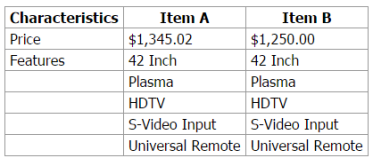
The BLS neatly illustrates this effect with an example from their website (emphasis is mine):
regression2
Item A is a television that is no longer available and it has been replaced by a new television, Item B. The characteristics in bold differ between the two TVs. There is a large degree of quality change and there is a very large (400%) difference in the prices of these TVs. Rather than use the 400 percent increase in price between Item A and Item B, the quality adjusted rate of price change is measuredby the ratio of the price of Item B in the current period ($1,250.00) over an estimated price of Item B in the previous period – Item B’.
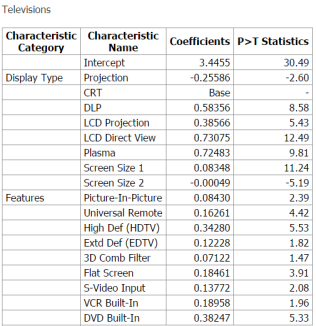
Here is an example of a hedonic regression model (including coefficients) for televisions.
cpihqa5form1
This is just an OLS linear regression model. The dependent variable is the natural log of prices for televisions, the explanatory variables and their coefficients are listed in the table below (most are dummy variables)
Where PB,t+s-1 is the quality adjusted price, PA,t+s-1 is the price of Item A in the previous period, and is the constant e [SIC], the inverse of the natural logarithm, exponentiated by the difference of the summations of the ßs for the set of characteristics that differ between items A and B. The exponentiation step is done to transform the coefficients from the semi log form to a linear form before adjusting the price.
To put it another way, the HQR extrapolates a price for the new TV using the Hedonic Quality model estimated from the population of old TV’s
To derive the estimated price of Item B’, we use the following equation:
For our television example, [the equation above] looks like this:
cpihqa6form4
When this quality adjustment is applied, the ratio of price change looks like this:
regression3
The resulting price change is -7.1 percent after the quality adjustment is applied.
Oh good! You see, my neighbor, John Q., thought that prices were going up and was about to riot in the streets because he couldn’t buy anything now. How relieved he was to live next to an economist and mathematician; I merely explained that even though he couldn’t afford the new TV (or anything else) it was actually less expensive once quality was taken into account. Boy was his face red. He went home and explained it to his wife and kids and they laughed and laughed about their mistake.
Read the rest here
Next time one hears media or experts utter "low" inflation keep in mind Mark Twain's warnings on statistics: Lies, Damned Lies and Statistics

Friday, August 29, 2014

Checklist for Claims that “There’s No Inflation”

From Zero Hedge/Shane Obata (bold original)
Presenting the “There’s No Inflation” Checklist

1) Don’t go to school – if you want to learn then turn on CNN. 

2) Don’t pay for medical care – if you get hurt then put on a band-aid and drink more water.

3) Don’t pay for transportation – if you have to get somewhere then teleport.

4) Don’t eat – if you HAVE to then cut your food into small pieces so it lasts longer (cough cough cough #McResources cough).

5) Don’t buy a house – if you have to live somewhere then pitch a tent in your local park.

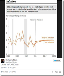
6) Look at stupid charts such as:

image
* because CBOs projections are always right (warning: do NOT check the CBO's track record)

7) Ignore charts such as:
8) Stop paying for things, idiot.
I may add

9) Don’t ask why product sizes have been getting smaller. Also never wonder why some of the quality of products have diminished. (This is called shrinkflation or value deflation) see examples at CNBC or at Dr. Malmgren’s Pinterest

Thursday, November 28, 2013

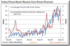
Thanksgiving Treat: The Turkey Inflation

In the US and elsewhere, media and their ivory tower experts allege that statistical CPI inflation has been “low”.

But not for the Turkey which will grace the dinner tables of Americans in celebration of Thanksgiving day…

image

Notes the Zero Hedge: (bold original)
While shoppers will perceive the discounts on Black Friday as 'saving' them fortunes, the cost of the 2013 Thanksgiving Day dinner may be the most expensive ever. As the gorging commences, despite an entirely benign inflation in the eyes of the Federal Reserve, the prices of everything from chocolate chip cookies to ice cream are on the rise. But it is the centerpiece of the meal that is weighing on pocket-books. As Bloomberg's Michael McDonough notes, Americans are paying the most for whole frozen turkeys since the Bureau of Labor Statistics began publishing data on the series in 1980.
Happy Thanksgiving.

Monday, October 07, 2013

Cracks in the Philippine Property Bubble?

The race to build real estate projects funded by debt by property developers and by the government has been rapidly inflating domestic property prices.

I was surprised to have read an article[1] citing a Jones Lang LaSalle (JLL) research as saying with unabashed confidence that despite soaring prices and massive supply growth there is no glut in the property sector (bold mine)
A sharp increase in new supply began in 2005. Since then, supply growth has averaged more than 30% annually. The total stock of condominiums jumped from 7,000 at the beginning of the millennium, to around 90,000 units by end of 2011, according to JLL. But Jll sees no glut, and CBRE Philippines’ executive director for global research and consultancy, Victor Asuncion, shares the same viewpoint….

Vacancy rates in Makati rose to 11.7% in Q1 2012 from 9.4% a year earlier, according to Colliers. The rise is attributable to new condominiums adjacent to, but not in, Makati - and in regions near Metro Manila.
This is a prime example of Warren Buffett’s advice of “never ask a barber if you need a haircut”. People will continue to talk up their industry regardless of the risks and of reality.

Common sense tells us that if economic growth stands at 7%, and supply side growth is at 30% annually for the last 8 years, unless the law of economics grind to a halt, eventually there will be a glut.

But the statistical economic growth which the article relies on as demand for burgeoning supplies has exactly been driven by the supply side growth of the property sector.

The article says that a remittance based demand is likely to slow due to factors which they refer to World Bank as -Stricter Implementation of the migrant workers’ bill of rights; -Political uncertainties in host countries; and -The slowdown in the advanced economies. The Pollyannaish article also pins on the growth of BPO industry as potential source of demand.

Yet the rise in vacancy rates in Makati by 11.7% from 9.4% while seemingly statistically small represents a 24.45% increase! And this could be the periphery to the core process.

I have pointed out in the past that the Asian crisis was partly triggered when Thailand’s vacancy rates soared to 15%[2].

The article only confirms my observation of a debt driven property bubble.
Total real estate loans country-wide soared by 42% to PHP546.51 billion (US$12.47 billion) in 2012 from the previous year, based on figures from the Bangko Sentral ng Pilipinas (BSP), the country’s central bank. Despite the spectacular growth, the size of the mortgage market remains small at about 5.5% of GDP in 2012.
Of course, the mortgage market is small and will likely remain small because of the limited penetration level by the population on the formal banking industry. This isn’t Singapore or Hong Kong. We should see a bigger enrolment of the population on the banking industry first before we can expect the mortgage markets to expand. And the banking industry would have to downscale regulations for more people to enrol. 

The property market reflects on the conditions of the stock market. 

image
Figure 8 World Bank Market Cap as % of GDP

The boom in local stocks which in 2012 market capitalization of listed companies according to World Bank accounts for 105.6% of the GDP[3] has only added 22% for a total of 525,850 accounts for the entire PSE brokerages from 2007[4]. This means that booming stocks benefits less than 525,850 accounts (individuals or corporations) or particularly the 83% of market capitalization controlled by a few families whom are now using aggressive leveraging.

The article also notes that “Most houses are sold for cash or pre-sold. Property buyers also face high transaction costs, corruption and red tape, fake land titles and substandard building practices.” The cash transactions are manifestations of clout of the informal economy and the dearth of access to the formal banking sector. And part of the preselling has been financed by developers themselves which the World Bank calls as the domestic shadow banking industry[5].

Finally here is the kicker, from the same article “Recovery from the subsequent crash has been slow. Nominal prices are now back above 1997 levels, but prices are still 46% below pre-Asian crisis peak levels in real terms (Q1 2012) – an astonishing reminder of how much the crash cost.”

Real terms (based on government statistics) don’t seem as an adequate or accurate representation property values.

My neighbourhood store raised the prices of my favorite merienda lumpia by 20% about 2 weeks ago. My daughter’s favorite pie Banoffee recently jumped by 10%. My favorite vendor who maintains his fishball price at 50 cents has shown a considerable shrinkage in the size of his products. I asked why this is so, he says that his supplier can’t raise prices so they deflate the size of their products. Real time economics from the man on the street. Even government’s lotto prices has recently been doubled which accounts for 3.93% lotto inflation. My neighbourhood rental prices have increased by about 10%.

The statistical world is far from the real world. It seems ivory tower economists don’t ever spend at all to know of this reality.

And by the way, a domestic central banker admits that CPI prices don’t accurately reflect on real inflation. At a Bank of International Settlements paper BSP Deputy Governor Diwa C Guinigundo writes[6] (bold mine)
Excluding asset price components from headline inflation also has little effect. Currently, the CPI includes only rent and minor repairs. The rent component of the CPI is, however, not reflective of the market price because of rent control legislation. The absence of a real estate price index (REPI) reflects valuation problems, owing largely to the institutional gaps in property valuation and taxation. While the price deflator derived from the gross value added from ownership of dwellings and real estate could represent real property price, it is also subject to frequent revisions, making it difficult to forecast inflation.
There you have it. The cat is out of the bag. Philippine CPI inflation is NOT a reliable indicator of inflation.

Importantly, real estate nominal prices have reached the 1997 highs.

And lastly I often hear officials say how much a backlog in demand for property in the low end market as a retort against suggestions of bubbles. They have suggested that the shortage of the housing industry is as much as 7 million units[7].

The problem with this concept is that low cost and socialized housing is not a market based demand, but rather a political demand for housing.

The basic assumption is that lack of housing is mainly a pecuniary factor caused by inequality or the lack of social justice. So the government undertakes programs to expand homeownership via socialized or subsidized housing.

So for instance when the BSP claims that 68% of households owns or co-owns their houses[8], this leaves 32% of households who don’t own their homes. This includes me. 

So from the government perspective this represents “demand”. Since there are 20.2 million household according to Bureau of Census estimates as of 2010[9], 32% equals 6.4 million!

But homeownership has not just been a function of income. It is also a choice. I personally know of a family who rents their residence at a posh exclusive village in Makati for years even when they can afford to buy 10 of them.

So the reality is that when vested interest groups ask the government to undertake mass housing projects to fill in an imagined demand gap for a cosmetic goal of social justice, the real issue is the transfer of resources from taxpayers to politically connected business firms, bureaucrats and to some welfare beneficiaries.

My guess is that the ongoing leveraging by players in the property sector whom has access to the banking system may be acquiring properties from the 68% of households and selling these projects to the same high end sector whom have been speculating both in stocks and in properties

image
Figure 9 US Homeownership rates

At the end of the day political demand via interventions to attain homeownership goals by blowing bubbles usually end up with the opposite effect. This can be seen in Figure 9[10]

The US experience should be a valuable example where homeownership rate has plunged to almost the 1995 levels even as homeownership programs spanned from different administrations[11].

Property bubbles will hurt both productive sectors and the consumers. Property bubbles increases input costs which reduces profits thereby rendering losses to marginal players but simultaneously rewarding the big players, thus property bubbles discourage small and medium scale entrepreneurship. Property bubbles can be seen as an insidious form of protectionism in favor of the politically privileged elites.

Property bubbles also reduces the disposable income of marginal fixed income earners who will have to pay more for rent and likewise reduces the affordability of housing for the general populace.

Outside the ethics of the property bubbles, the mania as shown by chronic overconfidence by industry participants, nominal prices of real estate at 1997 highs and signs of rising vacancy rates could be seen as a potential red flag especially if the bond vigilantes will reassert their presence.


[1] Global Property Guide House price rises accelerating in the Philippines September 11, 2013


[6] Diwa C Guinigundo Measurement of inflation and the Philippine monetary policy framework Bank of International Settlements

[7] Business Mirror Developers see housing woes worsening September 28, 2013

[8] Bangko Sentral ng Pilipinas 2012 Annual Report