Showing posts with label chartoftheday. Show all posts

Friday, February 06, 2015

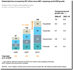
Charts of the Day: As of 2Q 2014,Global Debt has reached 286% of GDP! China Debt at 282% of GDP!

From a recent study by McKinsey Quarterly : Debt and (Not Much) Leveraging

image

McKinsey summary: Since 2007, global debt has grown by $57 trillion, raising the ratio of debt to GDP by 17 percentage points.* Developing economies account for roughly half of the growth, and in many cases this reflects healthy financial deepening. In advanced economies, government debt has soared and private-sector deleveraging has been limited. 

My comment: As for developing economies: has this been about financial deepening or about boom bust cycles?

image

McKinsey summary: Fueled by real estate and shadow banking, China’s total debt has quadrupled, rising from $7 trillion in 2007 to $28 trillion by mid-2014. At 282 percent of GDP, China’s debt as a share of GDP, while manageable, is larger than that of the United States or Germany.* Several factors are worrisome: half of loans are linked directly or indirectly to China’s real estate market, unregulated shadow banking accounts for nearly half of new lending, and the debt of many local governments is likely unsustainable. 

My comment: How "manageable" is manageable? Comparing China's capacity with US or Germany signifies a contrast effect--depends on what is being compared. To give you an idea, per capita GDP (IMF measures  2013) of China has been estimated at $11,868 while the US and Germany has $53,001 and $43,475 respectively. If we use this in the prism of looking at the debt levels, then the US and Germany has more capability to manage debt than China has been. Again contrast effect.

Nonetheless the critical issue has been how nations today have become addicted to debt. And debt is no free lunch.

Monday, January 19, 2015

Charts of the Day: Why a Pope from a ‘Poor’ Country

Domestic media inquires: Why has the incumbent Pope been chosen from a ‘poor’ country (emerging markets)?  Pope Francis hails from Argentina. Previously Popes were elected from mainstream Europe

The following charts from Pew Research via washingtonpost.com may explain why:
image
image

Bluntly put, to revive Catholicism in Latin America, a Pope must represent the region.

However so far this doesn't seem to be working. Again the Washington Post (November 2014):
Pew notes that its own data may not show the "Francis Effect," as he only took the papal position in March 2013. However, the report then adds: 
[Former] Catholics are more skeptical about Pope Francis. Only in Argentina and Uruguay do majorities of ex-Catholics express a favorable view of the pope. In every other country in the survey, no more than roughly half of ex-Catholics view Francis favorably, and relatively few see his papacy as a major change for the Catholic Church. Many say it is too soon to have an opinion about the pope.

Saturday, November 29, 2014

Charts of the Day: Wow…Oil Prices Just Collapsed!

Oil prices just had a shocking one day meltdown! Absolutely stunning…

image

WTIC –10.18%!

image

Brent –9.77%!

(charts above from stockcharts.com)

image

WTIC at 5 year lows (chart from zero hedge)

The last time oil prices got smashed was during the 2008 crisis when every risk asset endured a meltdown, except US dollar and US treasuries. 


This time is different?

Saturday, July 19, 2014

Chart of the Day: Inflation's Income and Substitution Effect on American Consumer Spending

The fundamental dynamic behind price inflation would be a shift in consumer spending pattern. Without corresponding increases in income, consumer price inflation leads to the income and substitution effect.

The income effect from higher prices is to reduce or lower demand.

The substitution effect switches spending to focus on the "needs" rather than on the "wants". 

In short, consumer price inflation reduces disposable income.


As CPI builds, we see the same dynamics unfolding in US consumer spending as exhibited by the chart from Zero Hedge/Goldman Sachs

Tuesday, May 13, 2014

Chart of the Day: The Fed’s Forecasting Models are Broken

image
(hat tip Prof John Cochrane)

This Bloomberg article shows that the Fed Chair Ms. Yellen has also been concerned over "broken" inflation forecasting models:
Federal Reserve Chair Janet Yellen is concerned that the standard models central banks use to forecast inflation may be broken.

Behind her disquiet: the failure of the models to foresee the path of prices in the U.S. during the last recession and its aftermath and in Japan during its deflationary period from 1998 to 2012. U.S. inflation has been higher than the simulations suggested, while Japanese price declines proved more persistent.

Yellen alluded to her concerns in a speech last week, saying the Fed has to “watch carefully” to see if inflation picks up as the central bank projects -- and hopes -- during the next few years.
From broken GDP to inflation forecasts, yet whatever the monetary politburo says financial markets seem to believe them. [As a side note: This applies not only to the Fed but to other central banks as well.]

The great Austrian economist Ludwig von Mises tells us why they will keep making the same mistakes:  (bold mine)
In the equations of mechanics we can introduce constants which have been determined with reasonable exactness through empirical experimentation. In this way we can ascertain unknown quantities from given data with an accuracy sufficient for technology. In the field of human action, however, there are no such constants. The equations of mathematical economics are therefore useless for all practicai purposes

Tuesday, December 17, 2013

Charts of the Day: Incredible Bubbles in Twitter and Moncler

FT Alphaville’s Paul Murphy has been horrified by the following charts which he calls as “this is nuts”.

Twitter….


Why?


Next, Italian skiwear maker Moncler a company that specialises in €1,000 jackets.


Why has Mr. Murphy been terrified with Moncler?


I would be running scared too…

Tuesday, November 19, 2013

Chart of the Day: A Gold to Bitcoin Rotation?

image

Bitcoin has more than doubled during the past two weeks. 

Bitcoin was last traded at 784 per USD dollar (Mt. Gox) while gold at $1,275 (stockcharts.com).

Monday, November 18, 2013

Charts: Yellen’s No Build Up in Leverage and No Price Misalignments

At the confirmation hearing in the halls of the US Congress, incoming US Fed Chairwoman Janet Yellen testified[1]
I don’t see evidence at this point, in major sectors of asset prices, misalignments. Although there is limited evidence of reach for yield, we don’t see a broad buildup in leverage, where the development of risks that I think at this stage poses a risk to financial stability.
The following is a showcase of charts and reports from which Ms. Yellen “don’t see a broad buildup in leverage” and “don’t see evidence at this point, in major sectors of asset prices, misalignments”

“No build up in leverage”

image

US commercial and Industrial loans are at 2007 highs. Consumer loans have equally been climbing now approaching 2010 levels.

image

US banking exposure to the commercial real estate sector has been skyrocketing where CRE loans outstanding notes the Institute of International Finance (IIF) now stand at some USD 200 billion above pre-crisis levels.

Also US mortgage REIT assets have more than tripled since the crisis. Yet the IIF warns US REITs are vulnerable to disruptions in repo markets, as repo market funding constitutes 90% of their liabilities[2]

image

U.S. covenant-lite loan issuance has soared past 2007 levels now at $210 billion year to date—“a multi-year record and almost three times that of last year” according to IIF.

US companies have reportedly been selling bonds at the fastest rate ever or on record as companies try to beat potential rate increases.

According to the Wall Street Journal[3],
The $1 trillion mark was passed in the 46th week this year, according to Dealogic. In 2012, the mark was passed in the 48th week, and in 2009, the mark was passed in the 50th week. Despite the record issuance, investment-grade corporate bonds haven't had a stellar year. They have posted a 1% negative return this month and a 2.16% negative return so far this year, according to Barclays
“No misalignment of prices”

image

The Wilshire US REIT Trust Total Market has passed the 2007 highs.

image

US Farmland prices has exploded vertically. The chart represents Iowa’s farmland prices based on the first semester of the year[4].

Although declining prices of commodities has been expected to slow simmering prices farmlands

From the Wall Street Journal[5]
A multiyear run-up in the value of farmland in the U.S. Midwest may be running out of steam.

Average cropland prices declined in parts of the Farm Belt in the third quarter from the previous quarter while rising at a low rate in other areas, according to separate reports this past week by regional Federal Reserve banks in Chicago, St. Louis and Kansas City.

The surveys also found that some agricultural bankers expect cropland prices to decline across the Farm Belt as 2014 approaches because big harvests this fall have driven grain and soybean prices sharply lower. Corn prices also are expected to weaken after the U.S. Environmental Protection Agency on Friday proposed for the first time lowering an annual requirement for how much ethanol should be blended into gasoline.
Talk about record prices. Last week’s art auction $380.6 million at the Sotheby’s nearly hit a record high previously set at $394.1 million. Nonetheless record auctions, according to a Bloomberg report[6] were set for seven artist including Andy Warhol, Cy Twombly, Agnes Martin and Martin Kippenberger.

Francis Bacon’s ‘Three Studies of Lucian Freud’ reportedly sold for $142.4 million at Christie’s to Acquavella Galleries which bested bested Edvard Munch’s ‘The Scream’. Meanwhile Jeff Koons sold his sculpture “Balloon Dog (Orange)” for $58.4 million, an auction record for a living artist, according to another Bloomberg report[7].

Soaring stock market prices, REITs at over 2007 highs, parabolic farmland prices and record art prices have been seen as no misalignment of prices. This time is different.

Frenzied Global Bonds
 
image 
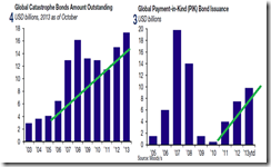
Around the world, global issuance of leveraged loans has vastly surpassed 2007 highs. Global corporate bond issuance particularly on High yield bonds has also reached records.

An update on this from the Financial Times[8] (bold mine)
Global borrowers with weaker credit quality are taking advantage of investors’ relentless search for higher yields to sell a record amount of bonds so far in 2013.

Intelsat, the world’s largest satellite-services company, the US casino owner Caesars Entertainment and the luxury chain Neiman Marcus have been among the low-rated borrowers to have sold a combined $38.1bn debt this year, according to Dealogic. That amount surpassed the previous record of $37bn for the whole of 2012.

Bonds with the lowest possible credit ratings have soared in popularity with investors, who have been diverted from top tier government and corporate debt where central banks are suppressing interest rates.
In today’s world, there is no such thing as default risks. Everybody has been piling up on one another to bid for companies even with the worst credit rating. That’s because zero bound rates and QEs has been seen to last forever.
image

Same record high story with global catastrophe bonds and non record but rapidly rising Global Payment in Kind Bonds

See NO bubble. Move along, nothing to see here.


[3] Wall Street Journal Companies Sell Bonds at Fastest Pace on Record November 14, 2013

[4] Irreplaceable Capital The Butterfly Effect June 15, 2013

[5] Wall Street Journal Midwest Farmland Values: Past Peak Season? November 15, 2013


[8] Financial Times Record sales of lowest rated bonds November 14, 2013

Saturday, November 16, 2013

Charts of the Day: Obamacare Enrollment–3.9 Million

The goal of Obamancare (Affordable Care Act), according to Wikipedia.org, is to increase the quality and affordability of health insurance, lower the uninsured rate by expanding public and private insurance coverage, and reduce the costs of healthcare for individuals and the government. (bold added)

Here is what Obamacare has done so far…

cat

4.02 million Americans has had their insurance policy cancelled….

….while 106,185 people has enrolled. Net enrollment –3.9 million (hat tip Zero Hedge/Wall Street Journal) 

Upon realizing this, President Obama backtracks and said “insurers can extend by one year those policies they had canceled for failing to meet the law's requirements” (WSJ)

And in response, the House of Representatives just passed a bill "to let insurance companies sell health plans that had previously been canceled due to ObamaCare regulations" (Fox).

Obamacare’s monumental failure serves as vindication of the great Austrian economist Friedrich August von Hayek who warned of the adverse effects from the Fatal Conceit of central planners:(bold added)
If we had deliberately built, or were consciously shaping, the structure of human action, we would merely have to ask individuals why they had interacted with any particular structure. Whereas, in fact, specialised students, even after generations of effort, find it exceedingly difficult to explain such matters, and cannot agree on what are the causes or what will be the effects of particular events. The curious task of economics is to demonstrate to men how little they really know about what they imagine they can design.

Thursday, September 12, 2013

Chart of the Day: Obamacare Regulations: 8 Times Longer Than Bible

image

From CNS News (hat tip Tea Party Economist)
Since March 2010, when President Barack Obama signed the Patient Protection and Affordable Care Act (PPACA) and its companion Health Care and Education Reconciliation Act (HCERA), the administration has published in the Federal Register 109 final regulations governing how Obamacare will be implemented.

These regulations add up to 10,516 pages in the Federal Register—or more than eight times as many pages as there are in the Gutenberg Bible, which has 642 two-sided leaves or 1,286 pages.
From the admonitions of Roman orator lawyer and senator popularly known as Publius Tacitus (or Gaius Cornelius Tacitus) [Annals 117]
laws were most numerous when the commonwealth was most corrupt (or the popular variant: The more corrupt the state, the more laws)

Wednesday, August 07, 2013

Chart of the Day: Troubled Currencies

Cato Senior Fellow and John Hopkins University Professor Steve H. Hanke in the following table shows where the risks of currency crises are 

image

Thursday, June 20, 2013

Tuesday, June 18, 2013

Chart of the Day: Filipinos are the Biggest Gin Guzzlers in the world

Interesting data on global alcohol consumption

image

Filipinos reportedly holds the title as world’s biggest gin guzzlers, according to a recent study. 

Aside from gin, the Philippines ranks third in rum consumption.

From the Economist
ASIA'S growing middle classes are driving demand in the global spirits market. According to IWSR, a market-research firm, consumption last year grew by 1.6% to 27 billion litres—and China, the world’s biggest market, quaffed 38% of that. The national liquor, baijiu, accounts for a whopping 99.5% of all spirits consumed there, so China does not even feature in rankings of the best-known internationally consumed spirits, below. The most popular of these is vodka, mainly because it is drunk in copious amounts in Russia. Russians downed nearly 2 billion litres of the stuff in 2012, equivalent to 14 litres for every man, woman and child. (Unsurprisingly, perhaps, Russians are among the biggest drinkers in the world, according to the most recent World Health Organisation data.) The Filipinos' taste for gin can be attributed in part to good marketing and to the spirit's long-established toe-hold in the local market. Ginebra San Miguel, a firm that makes the world's two best-selling brands, started operations there in 1834.
Philippine gin consumption has been estimated as having a 43.5% of the world market, according to the ginvodka.org
The Philippines is the world’s largest gin market. The Philippines spirits market comprises nearly 50 million cases and is dominated by domestically produced spirits (98%). The Gin market, in which San Miguel is by far the largest brand, is 22M cases (62% of the market) but this is very approximate. In global terms, Philippine gin accounts for 43.5% of the world gin market. Imported gins account for a miniscule proportion of the market but some UK owned gin brands are produced locally.
I wouldn’t exactly equate gin consumption as signs of a “growing middleclass”, since local gin and rum are the cheapest alternative among available alcohol spirits.

I have no data on the domestic distribution of gin and rum sales for both local and international brands, but I suspect that the bulk of the sales from local brands may come from the provinces.

A growing middle class should translate to a shift to pricier alternatives.

By the way, vodka consumption represents as the largest share of alcohol mainly due to Russian consumption as noted above.

Saturday, May 25, 2013

Chart of the Day: 12 technologies will drive our economic future

The Washington Post cites a chart from a study by McKinsey Quarterly:
Source: McKinsey Global Institute
Most of the aforementioned technologies can be summed as the entwined functionalites of the ongoing revolutions of big data, communications and smart manufacturing. Such technologies are bound to decentralize the global economy that would intensify frictions with the current state of centralized political systems. 

Yet if central bankers and power insatiable politicians have not been pushing the economic system to Hades, I would dwell heavily on the above technologies.


Monday, April 29, 2013

Charts of the Day: More Signs of Parallel Universe

Fantastic charts of the growing disconnect between the real economy and financial markets courtesy of central banking heroic policies.

All charts from Zero Hedge
image

Surging Global Stock Markets (MSCI) amidst statistical economic growth (GDP) lethargy

image

Since employment conditions are part of economic conditions, the detachment between equity price actions and unemployment rate has been especially elaborate in Europe.

 image

Again the seeming irrelevance between earnings (via revisions) and stock market price actions in the US.

image

And who says rising Non Performing Loans (NPL) equals higher rates? Not in Spain (and Italy) where banking system has been loading up in government debt. (zero hedge)

Such parallel universe or the glaring disconnect are really bubbles or illusions which are symptoms of monetary disorder (dictionary.com definition: destroy the order or regular arrangement of; disarrange) brought about by unsound central banking policies.

Tuesday, March 19, 2013

Charts of the Day: World Military Spending and Arms Trade

Two related charts of the day

First world defense spending

image

The Economist speculates that if the current rate of growth persists, China will surpass the US in terms of military budget. 
AMERICA still spends over four times as much on defence as China, the world’s second-biggest military spender. But it has been clear for some time that on current trends China’s defence spending will overtake America’s sooner than most people think. What is less clear is when that date will be reached. It all depends on the underlying assumptions. The 2013 edition of the Military Balance published by the London-based International Institute for Strategic Studies (IISS) shows convergence could come as soon as 2023. That is based on extrapolating the rate of Chinese military spending since 2001—a 15.6% annual growth rate—and assuming that the cuts in the America's defence budget required under sequestration are not modified. The latter is more likely than the former. The latest Chinese defence budget is based on spending increasing by a more modest 10.7% annually. That would mean that China overtakes America in 2032.

However, if China’s headlong economic growth stalls or if more money is needed to serve the health and social needs of rapidly-ageing population, China might slow spending on its military by something like half its current projection. If that happens, the crossover point could be delayed by up to a decade. It is also possible (though at present America’s fiscal travails suggest otherwise), that as China rises, America will feel forced to start spending more if the security guarantees it currently makes to allies such as Japan, South Korea and Taiwan are to retain their credibility into the third decade of the century. Already, China spends more on defence than all of those three together. It is all very well for America to talk about a strategic rebalancing towards Asia, but if the money is not there to buy the ships, the aircraft and all the expensive systems that go with them, it will eventually sound hollow.
The Economist is right to suggest that this trend may not continue as this will likely depend on the state of the China's economy. Of course this will really depend on priorities of the Chinese government.

But what they sorely missed is of the real nature of “strategic rebalancing”, which is not supposed to be about military buildup but about trade.

They forget about Bastiat’s wisdom where “if goods don’t cross borders, armies will”

Second chart global arms trade.

image

The Reuters notes that China has taken the fifth spot in arms exports with Pakistan being the main recipient.

An arms race serves as dangerous signal for world peace. Such also functions as a thermometer of the desperate state of welfare-warfare governments, who by resorting to inflationism, attempts to divert domestic political economic problems towards geopolitics. And they do this primarily through nationalist overtones.

The sad part is that instead of the remedy of channeling resources into productive uses, an arms race means more economic hardship for society, aside from greater risk of war.

The first panacea for a mismanaged nation is inflation of the currency; the second is war. Both bring a temporary prosperity; both bring a permanent ruin. But both are the refuge of political and economic opportunists
Unfortunately people hardly ever learn.

Friday, March 15, 2013

Chart of the Day: First Non European Pope in Nearly 1,300 Years

image
Chart from Reuters

Short non-related personal opinions

From the way headlines on the domestic mainstream media looked, it would seem that the Philippine candidate, Cardinal Luis Tagle, was shoo-in for the Papacy. [Sorry I didn't dwell on the articles] But this has hardly been the case from the perspective of international media.

Domestic media’s elaborate drumming up of the local cardinal represents no more than the sustained indoctrination of “nationalism”, which comes at the exclusion of the minority religions practiced locally.

Nevertheless, like his predecessor, the new Pope, Argentine Cardinal Jorge Mario Bergoglio, now Pope Francis I, has been said to be another anti-free market or pro-big government activist. [The Pope should see what big government has been doing to his homeland.]

We shall soon see.


Thursday, February 28, 2013

Chart of the Day: Careers of Political Leaders

image
The Economist writes
A POLITICIAN, a businessman, a comedian and an economist walk into a room. Unfortunately, this is not a joke—they all vie for the position of Italy's next prime minister. At an election this week the politician received the most votes, but not enough to govern. A deadlock now ensues. The career background of Italy's previous prime ministers is similarly eclectic. Between 1973 and 2010, the two main jobs held by prime ministers before they came to power were split roughly equally between lawyer, professor, and politician or civil servant. Economists featured only three times out of 23. And elsewhere, prime ministers with an economics background are also rare.

According to a paper by Mark Hallerberg of the Hertie School of Governance in Berlin, and Joachim Wehner of the London School of Economics and Political Science, policymakers with "technical competence" are more likely to hold office during a crisis. The authors found that a banking crisis increases the probability of having an economist as prime minister; a professor is more likely to hold the position during stockmarket crashes or inflation crises. Italy's Mario Monti and Greece's Lucas Papademos are recent examples. Unfortunately, voters seem inclined to get rid of them at the earliest opportunity.
Let us see how such a theory applies to the Philippine setting.
The record shows that the civil servant and lawyer background played a significant role in the Philippines political system for a vast majority of Presidents.

However recent trends reveals of a change. Since 1986, the trend of Philippine presidents appears to have gone against the lawyer experience.

11th Philippine president Corazon Aquino had been a housewife to a popular politician Ninoy Aquino. Mrs Aquino rose to political prominence after the assassination of her husband, which resulted to the ouster of the Marcos dictatorship and her presidency. So this seems to go in contrast with the notion of "technical competence" holding political office due to a political economic crisis 

Another EDSA revolution figure, Fidel V Ramos, served as the 12th Philippine president had a career as military officer before ascending to the presidency. Mr. Ramos  graduated as a civil engineer and has a Masters in Business Administration in Business Administration for his educational background.

Popular film actor and 13th Philippine president Joseph Estrada has been a product of the Asian Crisis. 

Mr. Estrada’s career has mostly been as an actor and as local government official who rose through the national political scene. Mr. Estrada was ousted in January of 2001 in a popular revolution due to charges of corruption. Ironically, despite the EDSA II revolution, Mr. Estrada placed 2nd in the 2010 presidential elections

The Estrada election seems as another example that defies the study of the "technical competence" as post-crisis political leader.  Instead such reveals of the populist character of Philippine democratic politics.

I would think that this idiosyncrasies in elections is a country specific rather than generalized view.

The 14th and the 15th Presidents had “economics” as educational background. 

14th Philippine president Gloria Macapagal Arroyo, beneficiary of the EDSA II revolution, had been an academic economist prior to becoming a politician. She was vice president to the ousted Estrada. Ms Arroyo won the 2004 presidential elections that has been clouded by scandals.

While Arroyo’s former student, and the incumbent 15th Philippine president Benigno Aquino III graduated as Economics major, but whose career had mostly been as local official.

The economists backgrounds of two recent presidents are hardly due to political responses from post-banking crisis. I may say that the logic runs backwards. Two presidents with economic backgrounds may have increased the risks of an economic crisis by embracing bubble policies.
 
Rather, since the Philippine presidency has mostly been about the spur of the moment politics, I think that the recent non lawyer trend may have been a happenstance. 

Sidestepping the professor-economist experience, the lawyer, civil servant and celebrity career records remain a dominant force in Philippine politics.

Nonetheless the increasing role played by economists and university profession (this applies according to the study cited by the Economist) in the field of politics tell us why we should distrust mainstream experts, as their mostly statist views could have been motivated by the desire to enter politics or to obtain careers in political institutions or agencies.

Friday, February 15, 2013

Chart of the Day: Odds of Death


The Economist writes,
ON FEBRUARY 15th DA14, an asteroid 45 metres across, will sail past the Earth at 7.8km a second (4.9 miles a second). At just 27,700km away, it is well within the range of communication satellites. It will be the closest encounter on record with an asteroid this big. In 1908 an asteroid estimated to be around 100 metres in diameter destroyed 2,000 km² of forest in Siberia. Thankfully, such events are rare. NASA has identified 9,600 "near-Earth objects" since 1995, but just 861 with a diameter of 1km or more. The greatest threat to Earth is the 140-metre wide AG5; but it has just a 1-in-625 chance of hitting Earth, and not until February 5th 2040. More prosaic things are far more dangerous. According to data from America's National Safety Council, 27 people died in 2008 in America from contact with dogs (a one in 11m chance of death). The chart below compares the odds of dying in any given year from choking, cycling, being struck by lightning or stung by a bee.
While the odds of dying from a heart disease (467:1) may seem greater than dying from an asteroid impact (74,817,414:1) may be true, the basic problem with extrapolating statistics is that we really can’t determine or we simply DON’T know when that big ONE will arrive in whatever form to claim us.

Thus we can be lulled into complacency by the use of statistics from the risks of false negative errors, or specifically, result/s that appears negative when it should not

This reminds me of what author Nassim Taleb calls as the Black Swan Theory: the extreme impact of certain kinds of rare and unpredictable events (outliers) and humans' tendency to find simplistic explanations for these events retrospectively.

For instance, the NASA suspects that DA14’s whizzing past earth may trigger tremors on some parts of the world. Has the impact from such event been incorporated in the computation of the above probabilities? 

A meteor blast in Russia caused 400 injuries a day before DA14. The meteor incident was denied by officials as having been connected with DA14.

If the authorities are right, then this simply reveals how the Russian meteor incident can be construed as an “unpredictable-outlier event” but with limited impact. In short, no one saw this coming.  Yet the incident does not satisfy the ‘extreme impact’ conditions of the black swan model.

On the other hand, if authorities could have been wrong, then the statistical odds of death may have been underestimated, since the likely methodology in arriving at such probability may have been seen only from a direct impact from a meteor/asteroid collision and not from the ancillary events, such as Russia's meteor shower (as defined by CNN), which could have been the advance party of DA14, or from other potential ramifications from meteor or asteroid flybys.

The bottom line is that people tend to overestimate their knowledge of the world and or of the universe to the point that environmental jeremiahs or ecological-phobes use scare tactics to impose social controls on us in order to shape the world according to their false ideals. 

As discussed before the world is much larger than us, where various forms of potential black swans abound: 
While we have been made aware by media of these apocalyptic scenarios through a variety of science fiction movies that could or may occur; such as huge asteroid/s crashing on earth, super volcano eruptions, alien invasion, robot uprising and many more, there are other factors such as the black hole, gamma rays from an imploding star or the unleashing of a mighty wave of solar flares from our sun, that could send our world into oblivion, unpredictably and instantaneously.
Speaking of black holes, a science or Astrophysical journal recently asserted that black holes have been growing faster than expected and have grown beyond the sphere of traditional assumptions where black holes require “galaxy collisions”. 

Our knowledge of the environment has been incomplete and keeps changing.